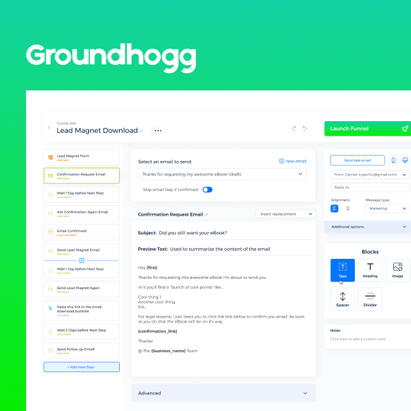
OVERVIEW I introduced User Interviews and redesigned the core CRM to use a visual drag-and-drop interface that improved users’ speed by 100% while boosting the emotional satisfaction.
PROJECT BRIEF Groundhogg is one of the top CRMs that leverages the WordPress platform.
They had a manual and clunky UX for the core feature of the campaign creation flow. My task was to redesign the section to be easier to use.
STRATEGY & METHODS I worked with customer development, user interviews, and surveys to uncover the main problems and needs of the users. Building on the findings I created a visual User Experience that was dead simple, intuitive and fun to use.
It also included a user flow for branch-based, conditional logic funnels to automate campaigns in the CRM. We tested and iterated the new designs before sending them into production. The positive response was overwhelming, both in terms of ease of use, verbal feedback, and beautiful emotional states from the clients.
Another benefit of the user research was an updated roadmap, that aligned the management agenda with that of the users for mutual growth. Groundhogg continued to do user interviews and testing to refine and improve the product and create new features.
I also created a design system based on the current development workflow and their needs. The design system helped to implement new designs faster and establish visual consistency for the future.